Product Sizing Modes
ProSelect offers three distinct sizing methods for products: Dynamically sized products can be scaled to any size while maintaining their aspect ratio. Fixed-size products are available in only one specific size and cannot be altered. Stacked sizing groups fixed size products, such as Wall Groupings, to give them the appearance of being dynamically sized.
Dynamically Sized Prints and Gallery Wraps
Dynamic sizing allows prints and gallery wraps, to be shown, ordered, and produced in various standard or customized sizes.
In Room view and Actual Size view, prints and gallery wraps (face size) are displayed in sizes based on your paper sizes. The order of the sizes in the Paper Sizes window is crucial as it determines the order in which the sizes are displayed. The default ProSelect setup categorizes sizes into folders based on similar size ratios (Standard, Square, and Pano). This means that in Room view, you can easily navigate through paper sizes, and the image crop dynamically adjusts to the various ratios.
If an image has a locked crop, the sizing will be anchored to the long dimension of the paper size, and the short dimension will be based on the aspect ratio of the image crop.
- In ProSelect's main display, use the Previous/Next Size tools

 to navigate through the available sizes.
 - Right-click on the Previous or Next size tool to reveal your paper sizes folders. You can move through the different folders from here.
- If a size isn’t showing, make sure it has a price attached to the presentation option you’re currently using.
To display the correct sizes when using dynamic templates, you must set up pricing for each size under every presentation option you plan to offer. If a size isn’t priced under the current presentation option, it won’t appear when browsing through sizes in the main interface.
Dynamically Sized Product Templates
Dynamic-sized product templates are handled slightly differently. When product templates are built, they are created with an absolute aspect ratio. If a template is built with a design size of 16x20, when that product is presented in a room, it will only be shown based on paper sizes that fit that aspect ratio (8x10, 16x20, 24x30, 40x50).
- In ProSelect's main display, use the Previous/Next Size tools to navigate through the available sizes created for the product.
- Right-click on the Previous/Next Size tools to view all the available sizes matching the template's aspect ratio.
- If a size isn’t showing, make sure it has a price attached to the presentation option you’re currently using.
Fixed Size is exactly what it implies. A product template is created to be specific to the Design Size only, and only that particular size will be available for ordering.
When a fixed-size template is created, there is no requirement for a corresponding paper size. The Design Size will serve as the final file size during production.
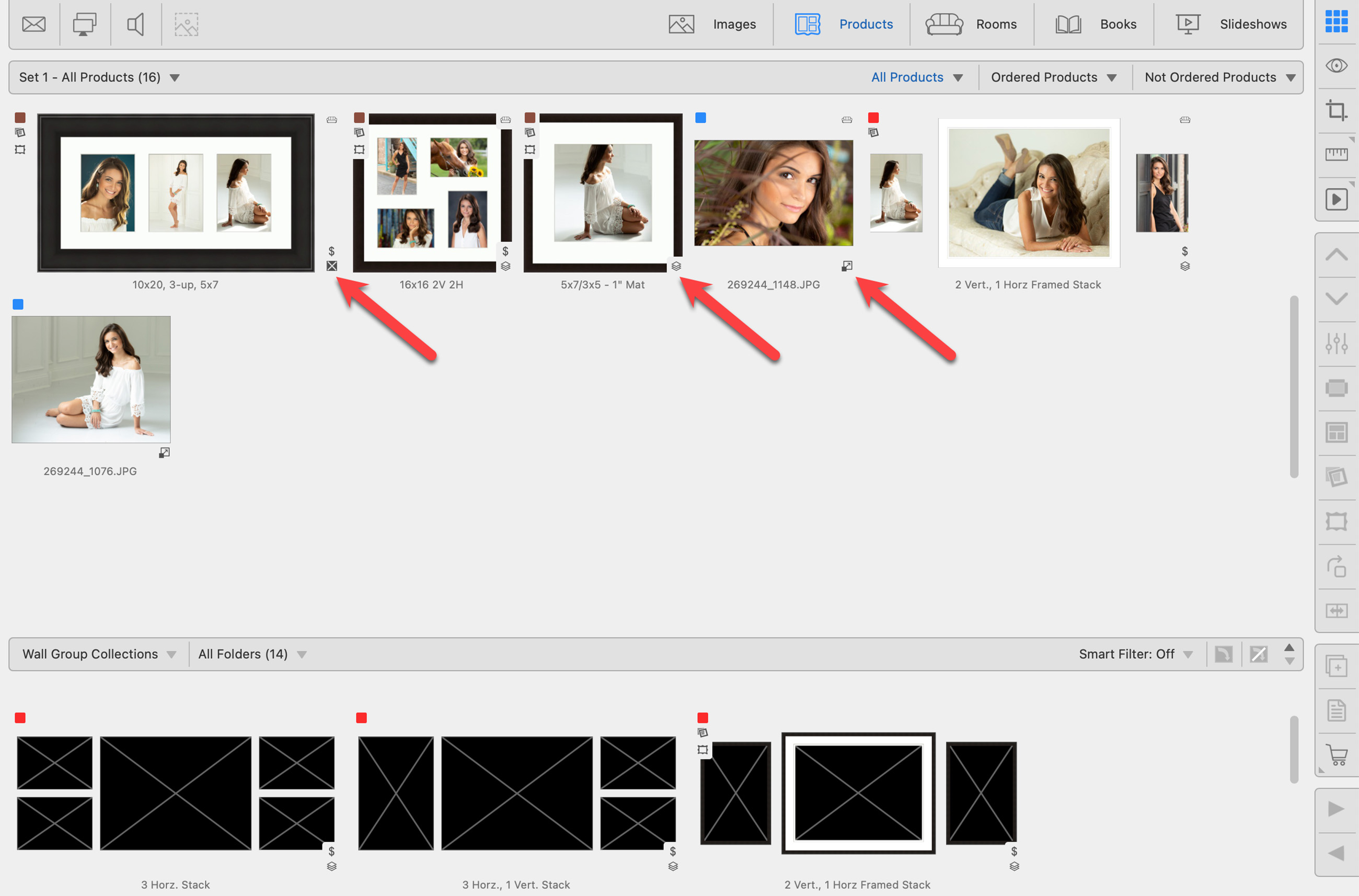
Stacked sizing allows users to load and populate multiple fixed-sized products simultaneously. This feature is particularly useful when offering products in different sizes with varying aspect ratios. Wall groupings, for example, work best when stacked, as they can consist of small, medium, and large sizes. Stacked sizing is ideal for wall groupings that contain multiple images and transition from one size to another, such as going from a large (24x30) to a medium (20x24), where the aspect ratios differ slightly.
Click on Using Stacked Templates to learn more.